
Random notes and information on my fonts... First and foremost, my fonts are free for
personal use only. Commercial users must
donate to obtain the rights to license my fonts commercially. A more detailed terms of use comes along with all font downloads. Also, I prefer those interested to
download my fonts from dafont.com. Other sites may feature old, out-dated and lower quality versions of my fonts.
Why are some of my fonts given the prefix, "LT," while others are not,
is there a difference in quality between those with the prefix and those without? To answer the second question, no, there is no difference in quality. As to the reasoning for a font to have"LT" affixed to their name, it basically depends on the font style and how I would like the font to be perceived.
Some fonts, like
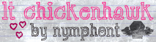
LT Chickenhawk, are given the prefix, because they are such a unique and completely genuine never-before-seen original style by myself. In adding "LT" to it's name I feel more secure, that it would always been known as
mine.
Many times the reason a font of mine lacks the "LT" prefix, because I want to lessen the amount that the fonts reception by "the public" and it's ensuing success or failure's relation to myself. Not that I am really well known, but since I have had at least one font in
dafont's Top 100 at all times during the past year, regular visitors as well as font authors might be familiar with me. And this might make them more or less apt to view and download my fonts.
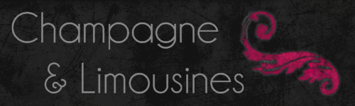
Champagne & Limousines for example, is a simple traditional (old-fashioned) styled geometric sans serif. I didn't want to clutter it up with a connection to me. I just wanted it to be
the typeface, Champagne & Limousines.
Others are self explanatory,
Nymph's Handwriting is another completely original font design, but I was comfortable that "Nymph" would be enough association to myself for me to feel secure.
Nymphette on the other hand... Let me tell you the truth about that font. The truth is, I hate that font. It could be better. I mean it looks good and all, but from a (novice) font-designers perspective... it could be better. Most wouldn't notice or mind that the glyphs have a ridiculous amount of points, but I know they do, and that bothers me.
The kicker is, thus far, Nymphette is my most successful font as far as longevity is concerned. Since it's debut 01-19-2009, Nymphette has remained in the Top100
I guess I am glad about it's success. Maybe not the most perfect of fonts, but it obviously serves a purpose, to remain so popular without any effort on my part to promote it. Though it's not one I would have chosen to be known for most, but what can you do?
I think
LT Oksana is extremely unique and has many characteristics that add-- for lack of a better word,
character to it's look.
I think in time, LT Oksana might be more appreciated. It's kinda neat I think.
Maybe someday, I will fix the kerning and spacing issues with the font, as the
kind folks at
abstractfonts.com also pointed out. Yeah, I should.
The Significance of the 'LT' Prefix ExplainedAnother thing, "LT" is a reference to myself, Lauren Thompson. Early in my "experimenting" with digital type, I "googled" myself and fonts. When several results pertained to
Linotype, I became a bit worried that some people might confuse my fonts as having some association with the foundry, which I do not. Nor am I trying to imply any or ride on
anyone's coat-tails.
But so far this fear has proven to be unfounded, no one has ever said anything of the sort, I haven't heard any mention of it. Thankfully.
Anyways, sorry for the bore, these were just some things I have felt the need to clarify for quite some time.
"Stay tuned and give your life a listen," ~Me, Lauren
Nymphont
 Free wallpaper for your desktop. It is one of my older ones so it is only 1024x768 resolution, but it's here free for the taking. Mouse over for enlarge buttons, click once to enlarge, and click again to close. Enjoy... or don't it's up to you.
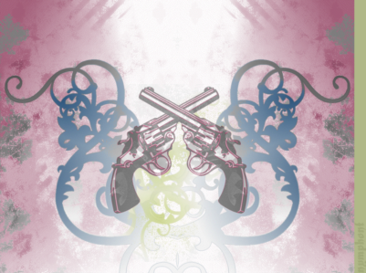


 Doing a little "self-googling" (yes I know that's totally dorky) I came across some examples of my "Fonts In Use." It's still really cool to me, not quite like hearing your song on the radio for the first time or anything, but it does have a similar affect.


 Free wallpaper for your desktop. It is one of my older ones so it is only 1024x768 resolution, but it's here free for the taking. Mouse over for enlarge buttons, click once to enlarge, and click again to close. Enjoy... or don't it's up to you.
 An example of Nymphont font's in use, this yoga book for children featuring LT Chickenhawk is to be published in Finland. Super cute, I love it!


 Hello, return visitors will surely notice that this blog has undergone yet another re-design. Being new to blogger, it took me just a bit to get used to their format. I think I am ready to settle down now with this look. Don't be scared now, please do leave a comment to let me know what you think of Nymphont's new look. Below are some captures of the looks that didn't last...


 Free wallpaper for your desktop. I made these desktop wallpapers for myself, but if you feel so inclined you may use them on your own desktop. They are some of my older ones so they are only 1024x768 resolution, but they're here free for the taking. Mouse over for enlarge buttons, click once to enlarge, and click again to close. Enjoy... or don't it's up to you.


 Oh man, yesterday construction in my neighborhood caused the cable to go out and I couldn't get a wireless signal for anything! I was mid many-a-project online, and wasn't able to get back till now! For a geek like me, no internet connection really sucks.


 Inspiring Vintage Script Typography

