 LT Chickenhawk, one of my more "recognizable" font designs, a decorative hand-drawn outline font, may have been the first to make it's public debut, but the "Chickenhawk" concept is an ongoing and has long been the theme of many of my "experiments in digital typography."
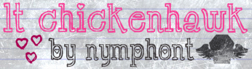
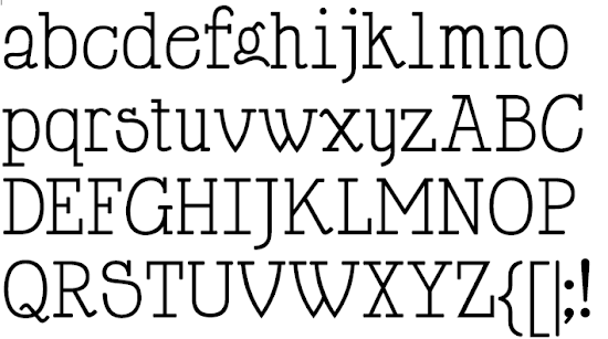
As a matter of fact, chickenhawk began as a serious, normal font,that is; not a decorative or hand-drawn font. I just set out to make the slab-serif-ish typeface that I kept envisioning a reality.

The start very first of my chickenhawk concept/themed font creations of is pictured above. This is also where I left off on this initial font, as I began moving onto hand-drawn renditions similar to the chickenhawk we know and love today.

The first hand-drawn look (above); however, was not an outline font like the LT Chickenhawk that I have published, but was the singular-line style of hand printing shown above. This version was actually completed as a font, but I didn't feel compelled so much to make it available publicly since I at this time became inspired to make it an outline style, which was to become LT Chickenhawk, the font I have competed and since released publicly.
Maybe I will reconsider making the singular-line style depicted above available too. I dunno. If I were t receive some requests about it or see that there is some interest in it, but for now it's just kept in my ever-expanding collection of assorted and unfinished fonts.
At any rate, as I mentioned, upon creating the first hand drawn chickenhawk font, I came up with the outline idea and focused my efforts in creating this design, which became the font LT Chickenhawk.
You might note, the hearts were a part of the original design. The hearts were something I knew might be risky and turn-off a few potentially, and would also limit the font to being seen as "feminine" rather than having no such limitation at all, but it was something I really felt I had no choice in. Once they were added into the design, they became something I felt I should not question, for if I did, I surely would remove them, thus, they could not be questioned at all, designing must commence!
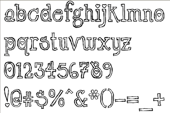
The final LT Chickenhawk Font design is shown above, My first "release" of the font did not include numerals and additional punctuation. I was happy to create and add these missing characters to the font and make it available after receiving many requests for me to do so, and positive feedback on the idea. Thank you to everyone for your feedback on that!
New ground is still being made in my chickenhawk experiments, as this slab serif design is one that I am still quite fond of and find endless ways in-which to take that inspiration. Recent chickenhawk experiments are focused on the crafting of a normal/not decorative version into a font, with traditional characters such as Latin upper and lowercase, punctuation and numerals sans hearts. This has been a side project of mine for several months now, and surely will be for several more months at least before it's completion.
Above is a glimpse at an early rendition of a second "chickenhawk" themed/concept font, which was to become the font family HappyPhantom, and also a third spinoff the Cupid De Locke Font.


No comments:
Post a Comment