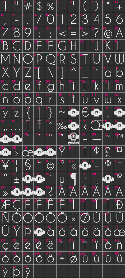
 Presenting the Caviar Dreams TrueType™ Font Family. More geometric sans-serif love, Nymphont style. Download contains 4 files, Caviar Dreams Regular, Italic, Bold, and Bold Italic. This font is free for personal use as well as commercial use. Yep. That's right.
Feel free to email me nymphont@yahoo.com if you have any questions, comments, or suggestions. I hope you like this font. Some might see a resemblance to my font Champagne & Limousines in this new creation. For that matter, I would like to highlight some of the qualities making Caviar Dreams truly unique.

« Download Font »
One key difference is the letter-spacing, which is a bit more generous than that of it's predecessor, affecting the way it looks in virtually all settings, large and small blocks of text, graphics, headings what-have-you.
I felt that this was necessary and would add to the quality of the font, as a congruent letter spacing is pleasing to the eye. The font family Champagne & Limousines is comprised of predominantly classically-shaped geometric letters, so it has a clean crisp appearance without as much spacing between the letters.
Which brings me to the other key difference in Caviar Dreams. The unconventional letter shapes it contains; shapes that stray from those classic renditions, giving Caviar Dreams it's own identity altogether.
To name a few, capital letters B, D, J and most notably, W. Then the lowercase e which is angled, and lowercase w, which shares the style of the capital W. The numbers are also completely different.
As a matter of fact, though Champagne & Limousines was Caviar Dream's public predecessor, it was actually born after Caviar Dreams. In my typical backwards fashion of font-making, I decided to finish Champagne & Limousines first because it was so classic, and put Caviar Dreams on hold because it's unconventional letter shapes would require some additional consideration and attention.
Caviar Dreams Font Family First 255 Characters

« List all Fonts ♥


No comments:
Post a Comment